Brand refresh - LOM architecture and design
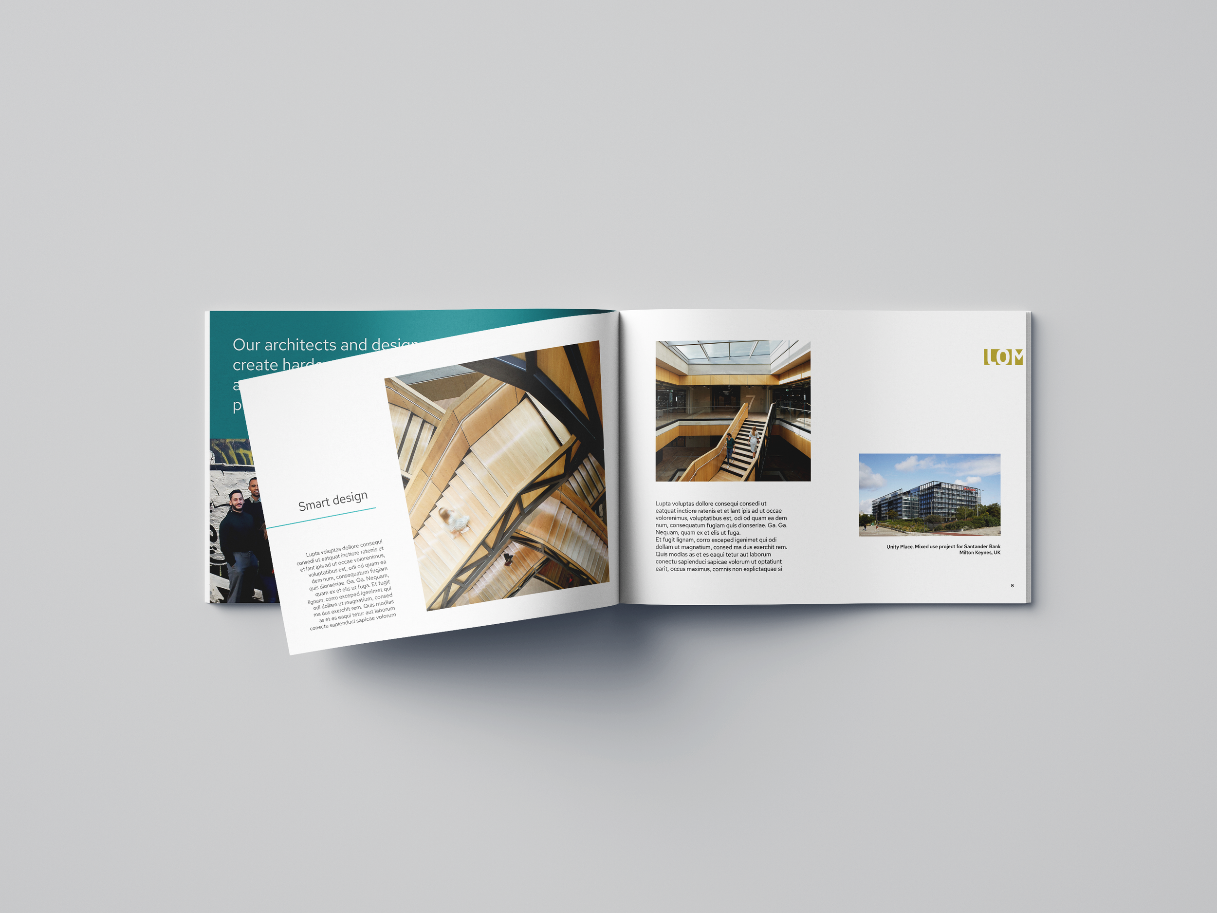
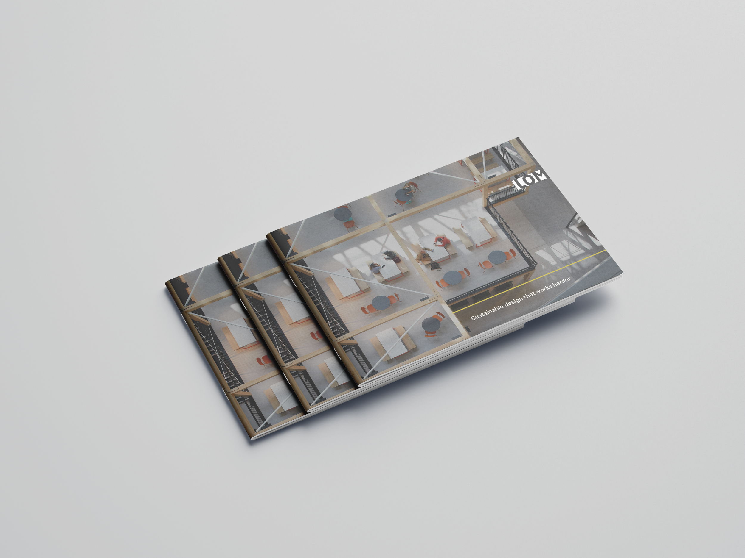
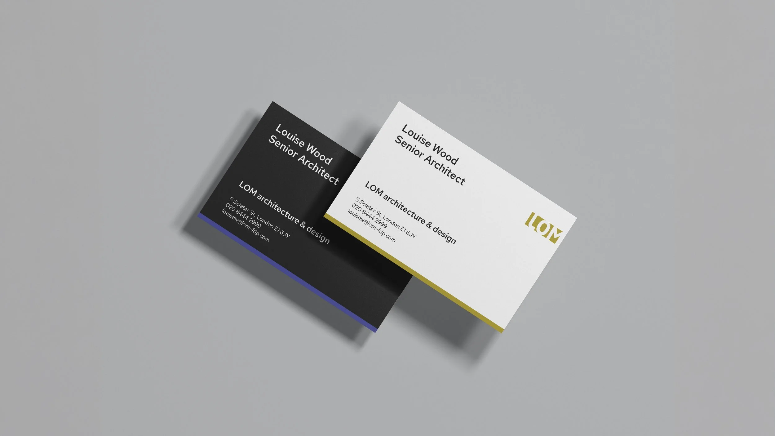
LOM is an architecture and interior design studio based in East London. This updated visual identity spans colour, typography and brand messaging, with the aim of collating key values to bring a contemporary feel to the brand.

One requirement was to keep the distinctive 'LOM Green’ colour as a key fixture of the palette, so a tonal grey was selected to improve contrast and versatility, in addition to a complementary highlight palette.
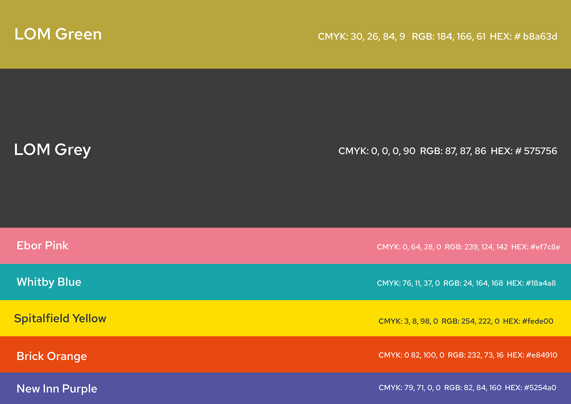
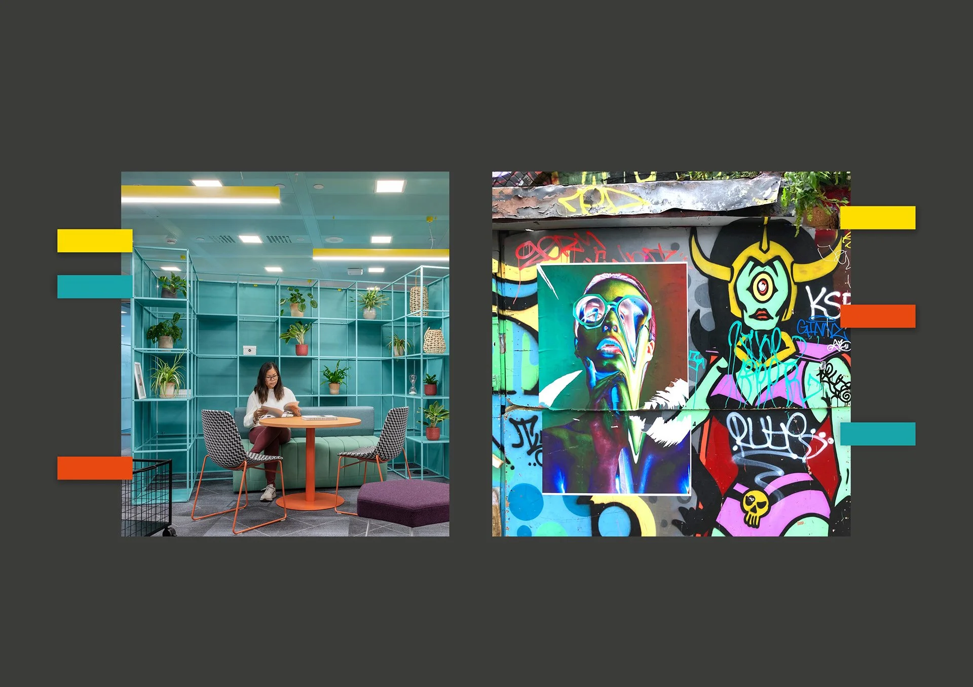
Research cross-referenced LOM's distinctive interior design colour schemes with the vibrant graffiti in the surrounding Shoreditch area.
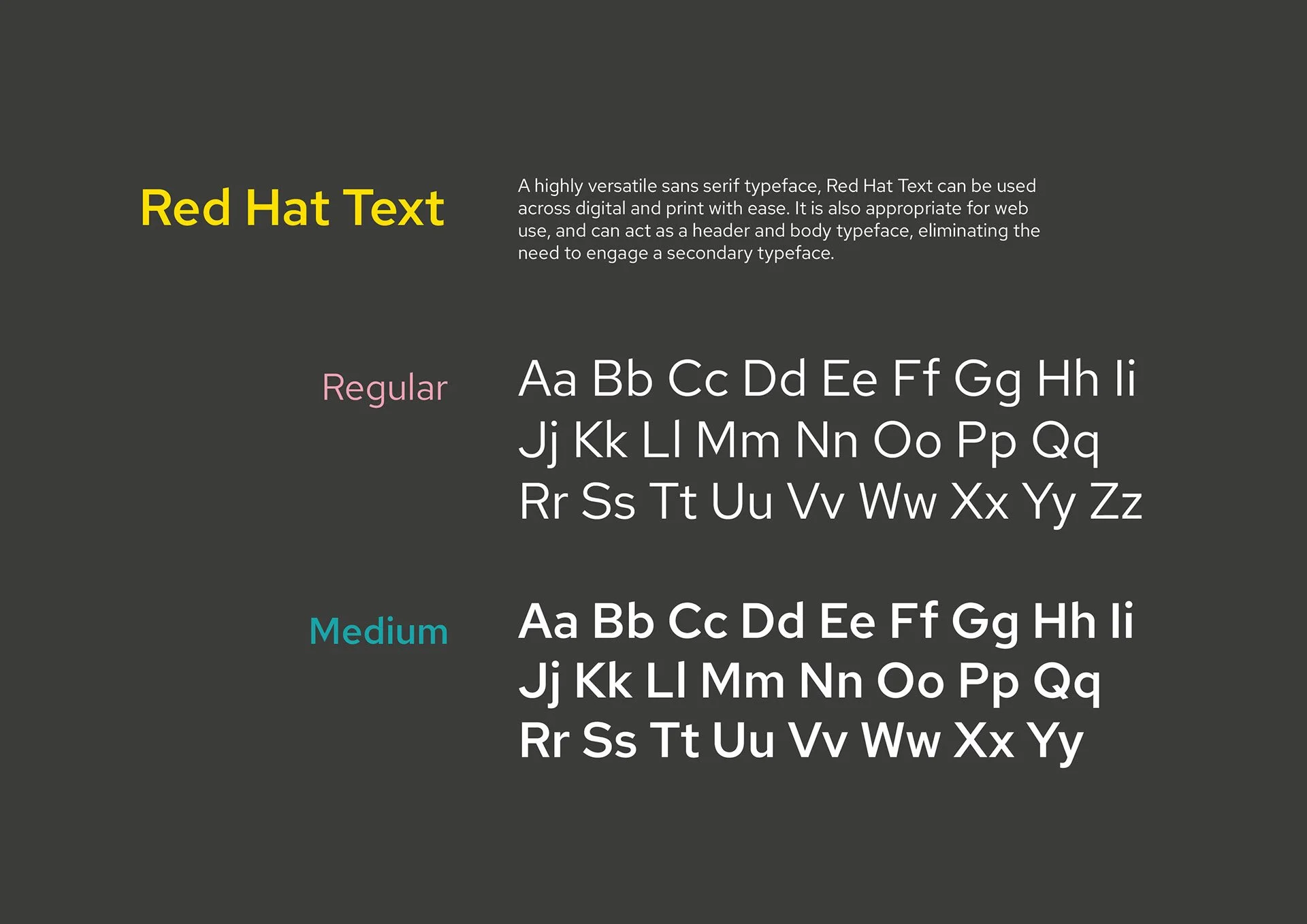
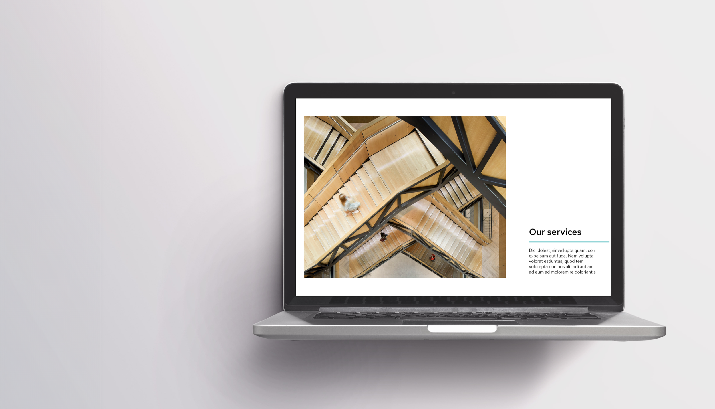
A carefully selected brand font family provided greater flexibility, allowing architects and non-designers to align across presentations and bids.